Dynamic Data visualization with D3 and Rx - part 2
In part 1 I introduced D3. in this part I will show how to dynamically update the graph with Rx.
Updating D3 element
D3 binds the elements to the data. It is very powerful. If we change the data, the element will rerender with the new values. We can use the same attributes that were defined when we build the chart when updating it. Moreover, D3 provides methods like transition, duration, delay and more so the update will be smooth and sexy.
Updating the data
Updating the data can be event driven from the UI by register to events, or by register to external events. If we would like to build dynamic visualisation, Rx is a perfect tool. It enable us to do almost anything:
- Get data from server periodically.
- Subscribe to data from websocket.
- Animations
- And many more.
You can think of many scenarios to use it. Monitoring an application, monitoring IoT devices, display stoke exchange data, sport events, earthquake, just name it…
Displaying sine wave
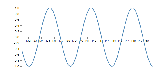
In this example I will show how to draw a sine wave that changes over time. You can take this example and use it for your special scenarios because the principals are the same.

The html is a bit more complicated, I added a reference to Rx, some styles, and buttons to start and stop the animation.
<html>
<head>
    <meta charset="utf-8">
    <title>Sine wave</title>
    <script src="https://cdnjs.cloudflare.com/ajax/libs/d3/4.4.0/d3.js"></script>
    <script src="https://d3js.org/d3-selection-multi.v1.min.js"></script>
    <script src="https://cdnjs.cloudflare.com/ajax/libs/rxjs/4.1.0/rx.all.js"></script>
</head>
<style media="screen">
    .axis path,
    .axis line {
        fill: none;
        stroke: grey;
        stroke-width: 1;
        shape-rendering: crispEdges;
    }
    .myline {
        fill: none;
        stroke: steelblue;
        stroke-width: 2px;
    }
</style>

<body>
    <button id="start">Start</button>
    <button id="stop">Stop</button>
    <script>
	// code goes here!
    </script>
</body>
</html>
The full code:
var w = 500, h = 200, margin = 40;
updates = [];
var pauser = new Rx.Subject();
var counter = Rx.Observable.interval(100)
    .pausable(pauser)
    .map(function(i) {
        return i;
    })

counter.subscribe(function(response) {
    var value = Math.sin(response / 10);

    updates.push({
        date: new Date(),
        value: value,
    });

    if (updates.length > 200) {
        updates.shift();
    }
    update(updates);
});

pauser.onNext(true);

d3.select("#start").on("click", function() {
    console.log("start");
    pauser.onNext(true);
})

d3.select("#stop").on("click", function() {
    console.log("stop");
    pauser.onNext(false);
})

var svg = d3.select("body")
    .append("svg")
    .attrs({
        width: w + margin * 2,
        height: h + margin * 2,
    })
    .append("g")
    .attr("transform", "translate(" + margin + "," + margin + ")");


var x = d3.scaleTime()
    .domain([new Date(), new Date()])
    .range([0, w]);

svg.append("g")
    .attr("class", "x-axis axis")
    .attr("transform", "translate(0 , " + (h / 2) + ")")
    .call(d3.axisBottom(x));

var y = d3.scaleLinear()
    .domain([-1, 1])
    .range([h, 0]);

svg.append("g")
    .attr("class", "axis")
    .call(d3.axisLeft(y));

var line = d3.line()
    .x(function(d, i) {
        return x(d.date);
    })
    .y(function(d) {
        return y(d.value);
    })

svg.append("path")
    .attr("class", "myline")

function update(data) {
    var minDate = data[0].date;
    var maxDate = data[data.length - 1].date;
    x = d3.scaleTime()
        .domain([minDate, maxDate])
        .range([0, w]);

    svg.selectAll("g.x-axis").call(d3.axisBottom(x));

    svg.selectAll(".myline")
        .transition()
        .attr("d", line(data));
}
First I added my Rx code:
 updates = [];
        var pauser = new Rx.Subject();
        var counter = Rx.Observable.interval(100)
            .pausable(pauser)
            .map(function(i) {
                return i;
            })

        counter.subscribe(function(response) {
            var value = Math.sin(response / 10);

            updates.push({
                date: new Date(),
                value: value,
            });

            if (updates.length > 200) {
                updates.shift();
            }
            update(updates);
        });

        pauser.onNext(true);

        d3.select("#start").on("click", function() {
            console.log("start");
            pauser.onNext(true);
        })

        d3.select("#stop").on("click", function() {
            console.log("stop");
            pauser.onNext(false);
        })
I defined an interval observable with a pauser (so I could stop it), the interval is100ms. I subscribe to this observable and in the function I manipulated my data. Every tick i add new data element with the current time and the value (with sine function). I remove old elements when the data array is full. After that I call the update() function with the updated array. Later I use D3 to subscribe to DOM elements, in order to control the pauser.
Update the D3 visualization
As you can see, building the chart is similar to part 1. The only difference is the domain and range of the scales, and the location of the x axis in the middle of the graph. I also added classes to the axes so I can style them and select them in my update method.
The update method:
 function update(data) {
            var minDate = data[0].date;
            var maxDate = data[data.length - 1].date;
            x = d3.scaleTime()
                .domain([minDate, maxDate])
                .range([0, w]);

            svg.selectAll("g.x-axis").call(d3.axisBottom(x));

            svg.selectAll(".myline")
                .transition()
                .attr("d", line(data));
        }
In this method I do two things: Update the line data Update the x axis and x scale Notice that I’m not appending new Items to the SVG. I select the axis and update it, and the same for the line, I just change its d attribute so it will get the new data. I also added transition to make the animation more smooth.
Conclusion:
D3 and Rx let the developer flexible way and full control to create dynamic data visualization. You can build wonderful things with these two libraries. The number of usages is enormous, From simple animation to full blown dashboards.
References
- Interactive Data Visualization for the Web - Scott Murray
- https://d3js.org/
- https://github.com/Reactive-Extensions/RxJS
