Dynamic Data visualization with D3 and Rx - part 1
D3 is a javascript library for data visualization. RxJs is a reactive programing model that allows to compose asynchronous stream of data. Anyone of those library are is very powerful. Together their power twice itself and can be used to build incredible things.
In this blog post I will demonstrate how to build a dynamic data visualization with D3 and Rx. I will build a dynamic line chart that its data will be received from Rx, and be visualized by D3. In the first part I’ll make an introduction to D3. An introduction to RxJS can be found here
D3
D3 is a JavaScript for creating data visualizations. D3 provide the following capabilities:
- Creating graphic element.
- Binding data to the elements.
- Transforming the elements, by changing their visual properties.
- Animations.
- Handling user inputs
It is not a chart library like highcharts or google charts. You cannot build an out of the box graphs with it, it is much more explicit and you need to define almost everything. The advantage is that as a developer you have much more control.
D3 building blocks
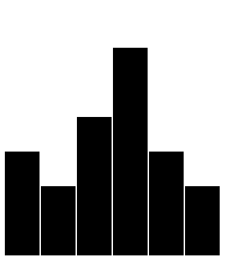
In D3 we can manipulate the DOM, but the most popular usage in by manipulating SVG elements. Let’s build a simple chart using D3 to identify its moving parts:

To run the code, just insert it to the following html:
<html>
<head>
    <meta charset="utf-8">
    <title>Rect chart</title>
    <script src="https://cdnjs.cloudflare.com/ajax/libs/d3/4.4.0/d3.js"></script>
    <script src="https://d3js.org/d3-selection-multi.v1.min.js"></script>
</head>
<body>
    <script>
      // insert here!!
    </script>
</body>
</html>
This is the code:
var w = 800,h = 500, barWidth = 50, space = 2
var data = [150, 100, 200, 300, 150, 100];
var svg = d3.select("body")
    .append("svg")
    .attr("width", w)
    .attr("height", h);
svg.selectAll("rect")
    .data(data)
    .enter()
    .append("rect")
    .attrs({
      x: function(d, i) { return i * (barWidth + space) },
      y: function(d) { return h - d; },
      width: barWidth,
      height: function(d) { return d; }});
Let’s see how it works: We define simple array of values:
var data = [150, 100, 200, 300, 150, 100];
We use the select method of d3 to get the body element of the page, then we create an SVG, and add it to body. Then we add width and height to the SVG.
 var svg = d3.select("body")
            .append("svg")
            .attr("width", w)
            .attr("height", h);
select __ will retrieve the first element that is qualify. __selectAll will retrieve all the elements that are qualifies. We will use it in a bit. D3 uses CSS-style selections to identify elements:
- Type selection: d3.select(“p”)
- Class selection d3.select(“.xAxis”);
- ID selection: d3.select(“#myLine”);
- D3 also support elements that are contained by other elements (div p) and multiple classes (.xPath.line).
append creates new DOM element appends it to the end of whatever selection it’s acting on.
attr is used to set an HTML attribute and its value on an element. You can also use attrs to set multiple values by using JSON object (in v4 you will need to use d3-selection-multi in order to do that).
Chaining Methods
D3 uses chaining method technique in order to make the code more clean and easier to understand. Many D3 functions return an element that has the next function. This allows you to attach “.” with the next method. Sometimes the order matters so you will need to know D3 Api.
Now that we have an SVG, we will add the chart:
svg.selectAll("rect")
          .data(data)
          .enter()
          .append("rect")
          .attrs({
            x: function(d, i) { return i * (barWidth + space) },
            y: function(d) { return h - d; },
            width: barWidth,
            height: function(d) { return d; }});
There is a little bit Inversion of control, we select the object that are not yet created (“rect”)
data is used to bind the data elements to the DOM elements. They will be accessed in the functions that are passed to the attributes. By convention d3 uses “d” to represent the current data element. You can bind various data types like arrays, csv, tsv and json.
enter is used to create data bound elements. It creates elements as the number of data elements.
The x coordinate of the bar. D3 passes us to values: d and i. “d” is the data element and i is the index. I’m using i to spread the item one from another.
The y coordinate of the bar. The SVG coordinate systems refer to 0,0 as the top left point of the SVG. We can the height of the SVG and calculate the point where to start draw the bar.
The width of the bar, no need to use function here because I use constant value.
The height of the bar, I use the “d” value to calculate the height, with the y attribute, it draws the bar perfectly as we expected.
Note that with the use of dada and enter and selecAll we enforce all the attributes to all the “rect” elements.
Scaling and Axes
Another important concept in data visualization is the use of scaling and Axes. Scaling provide us the way to normalize the data values to number of pixels. Axes will add the legend. D3 define few scales, such as continuous scales (linear, pow, time), sequential, ordinal, quantize and more for almost any type of scale you can imagine. The scale is a function that receives a domain (from which values), and a range (to what values). If we use that scale on a value we will get the calculation according to the range. For instance in the following example:
var yScale = d3.scaleLinear()
     .domain([0, 5])
     .range([0, 100]);
 console.log(yScale(1));	// 20
 console.log(yScale(4));	// 80
 console.log(yScale(5));	// 100
The axes is being defined using the scale. e.g:
d3.axisLeft(yScale)
will create a left oriented axis based on the yScale.

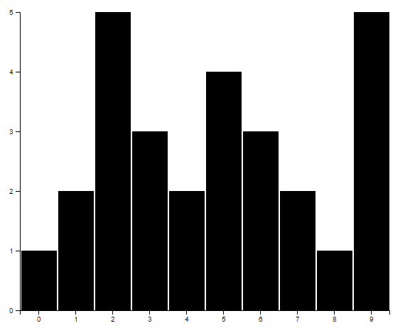
The code is a bit more complicated but I will explain it all:
var w = 800, h = 500, barWidth = 50, space = 2, margin = 40;
var data = [1, 2, 5, 3, 2, 4, 3, 2, 1, 5];

var svg = d3.select("body")
    .append("svg")
    .attrs({
      width: w + margin*2,
      height: h + margin*2,
    })
    .append("g")
    .attr("transform", "translate(" + margin + "," + margin + ")");

var yScale = d3.scaleLinear()
    .domain([0, 5])
    .range([h, 0]);

svg.append("g")
    .call(d3.axisLeft(yScale).ticks(5));

let xScale = d3.scaleBand()
    .domain(d3.range(0, data.length))
    .range([0, data.length * (barWidth + space)]);

svg.append("g")
    .attr("transform", "translate(0, " + h + ")")
    .call(d3.axisBottom(xScale));

svg.selectAll("rect")
    .data(data)
    .enter()
    .append("rect")
    .attrs({
        x: function(d, i) { return i * (barWidth + space) + space },
        y: function(d) { return yScale(d) },
        width: barWidth,
        height: function(d) { return h - yScale(d); }
    });
Notice that the data is numbers from 1-5, and we scale them to the chart. Also note that I added margin to the SVG in order to make space for the axes. The transform attribute is very useful to move elements around.
Creating the yScale:
var yScale = d3.scaleLinear()
          .domain([0, 5])
          .range([h, 0]);
The yScale definition is straightforward, one thing to notice is that i switched the ranged boundaries. This way, the axis will will be the way we expect it to be (again, 0,0 is the top left).
Now I can define the axis itself:
svg.append("g")
  .attr("class", "axis")
  .call(d3.axisLeft(yScale).ticks(5));
append(“g”) means that I’m appending group of elements, instead of one. The axis is built out of the axis line, the axis ticks and labels. D3 supports axis from any direction(left, right, top and bottom), it will not set the location of the axis, but it ticks and labels location in relation to the line. I added tick() in order to limit the amount of ticks.
Next we will define the xScale:
let xScale = d3.scaleBand()
              .domain(d3.range(0, data.length))
              .range([0, data.length * (barWidth + space)]);
scaleBand is used for discrete output, the domain is the number of data elements, and the range it the width of all the bar elements. Other discrete scale is scaleOrdinal, the difference is that scaleBand outputs are continuance. And the x axis:
svg.append("g")
  .attr("transform", "translate(0, " + h + ")")
  .call(d3.axisBottom(xScale));
Very similar to the Y axis, expect, this is axisBottom, and I moved it to the bottom of the chart by using transform-translate to the height of the chart. The bars are very similar, except I’m using the scale in order to normalize the data values
svg.selectAll("rect")
        .data(data)
        .enter()
        .append("rect")
        .attrs({
            x: function(d, i) { return i * (barWidth + space) + space },
            y: function(d) { return yScale(d) },
            width: barWidth,
            height: function(d) { return h - yScale(d); }
        });
Line chart
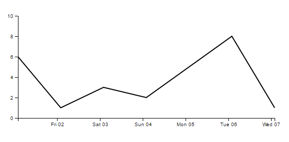
The next example will show how to create a basic line chart, because this is what we will practice with Rx:

var w = 500, h = 200, margin = 40;
var svg = d3.select("body")
    .append("svg")
    .attrs({
        width: w + margin * 2,
        height: h + margin * 2,
    })
    .append("g")
    .attr("transform", "translate(" + margin + "," + margin + ")");

var data = [
    { date: new Date('2016-12-01'), value: 6 },
    { date: new Date('2016-12-02'), value: 1 },
    { date: new Date('2016-12-03'), value: 3 },
    { date: new Date('2016-12-04'), value: 2 },
    { date: new Date('2016-12-06'), value: 8 },
    { date: new Date('2016-12-07'), value: 1 }];

var minDate = data[0].date;
var maxDate = data[data.length - 1].date;
var xScale = d3.scaleTime()
    .domain([minDate, maxDate])
    .range([0, w]);

svg.append("g")
    .attr("transform", "translate(0, " + h + ")")
    .call(d3.axisBottom(xScale)
        .ticks(d3.timeDay, 1)
        .tickFormat(d3.timeFormat("%a %d")));

var yScale = d3.scaleLinear()
    .domain([0, 10])
    .range([h, 0]);

svg.append("g")
    .attr("class", "axis")
    .call(d3.axisLeft(yScale).ticks(5));

var line = d3.line()
    .x(function(d) { return xScale(d.date); })
    .y(function(d) { return yScale(d.value); })

svg.append("path")
    .attrs({
        d: line(data),
        'class': 'myline',
        'fill': 'none',
        'stroke': 'black',
        'stroke-width': 2
    })
It is very similar to the previous example. Let’s review the differences: The data is more complex, it is a json object that contains date and value. The date will be our x, and the value the y. This way we can draw the line according to the time. D3 supports scaling and axes according to time.
var minDate = data[0].date;
var maxDate = data[data.length - 1].date;
var xScale = d3.scaleTime()
    .domain([minDate, maxDate])
    .range([0, w]);

svg.append("g")
    .attr("transform", "translate(0, " + h + ")")
    .call(d3.axisBottom(xScale)
        .ticks(d3.timeDay, 1)
        .tickFormat(d3.timeFormat("%a %d")));
I used for D3 scaleTime, and used the minimum date and the maximum date to set the domain. In the axis, I used time interval and time format to display the time nicely. The Y axis is the same as the previous example.
the line:
var line = d3.line()
            .x(function(d) { return xScale(d.date); })
            .y(function(d) { return yScale(d.value); })

svg.append("path")
    .attrs({
        d: line(data),
        'class': 'myline',
        'fill': 'none',
        'stroke': 'black',
        'stroke-width': 2
    })
In order to draw the line I used d3.line() with two functions, x and y, each returns the corresponding value - scaled date or scaled value. Then I appended a “path”, the main attribute is d which get s the line function with the data as parameter. I also added some styles. Notice how to add class to the elements. This is useful for both styling and D3 selections.
That’s it for this part. In the next part I will show how to use D3 with Rx to create dynamic charts.
The second part is here
The code can be found in https://github.com/amitai10/d3-rx
References
- Interactive Data Visualization for the Web - Scott Murray
- https://d3js.org/
